How to Curate an Iconic Preppy Room That Stands the Test of Time
Hello Cool-Girls ! Lately I’ve started thinking about all the iconic trends that marked my youth and then disappeared. The “Preppy” style is one of those trends that was super popular in the early 2010s. On Pinterest and Instagram, the colorful, kitschy outfits had practically become a uniform for an entire generation. Some brands built their success around this movement (Vineyard Vines, J.Crew..) others used it to give a boost to their already established brands like Ralph Lauren. The style was so popular that it eventually spilled into interior design too, though mostly in bedrooms rather than the whole home, as it was aimed at teens and young adults. Like the fashion trend itself, preppy interior design gradually disappeared from Pinterest, replaced by more neutral, beige, quiet luxury interiors. The result ? Today our homes are starved of color. And yes, the original preppy room was obviously too much, but it brought vitality and character. It just needed a little more finesse to become timeless.
As an Amazon Associate I earn a small commission from qualifying purchases. #publicité #ad
1. A Lemonade and Pastel Color Palette for a Preppy Room
The early 2010s were a more favorable time economically, a period of unapologetic opulence. Showing off success was part of the culture, and wearing brands was how you did it. Color was the symbol of that era: “lemonade” colors that echoed the dress code of Nassau and the endless summers of the East Coast.
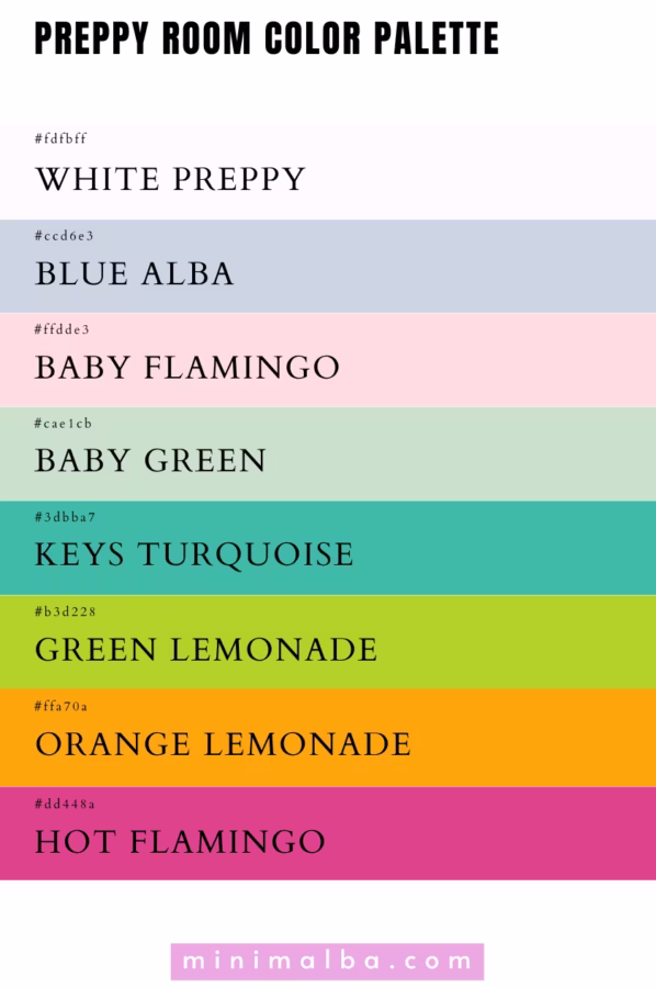
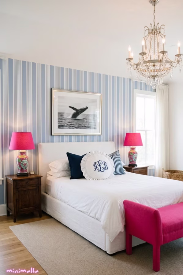
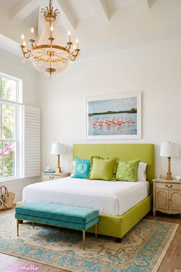
The preppy bedroom color palette was built around flashy shades of blue, pink, green and orange. The idea at the time was to combine as many of these colors as possible in a single space. And it’s precisely that lack of contrast that ended up saturating our eyes and wearing us out over time.
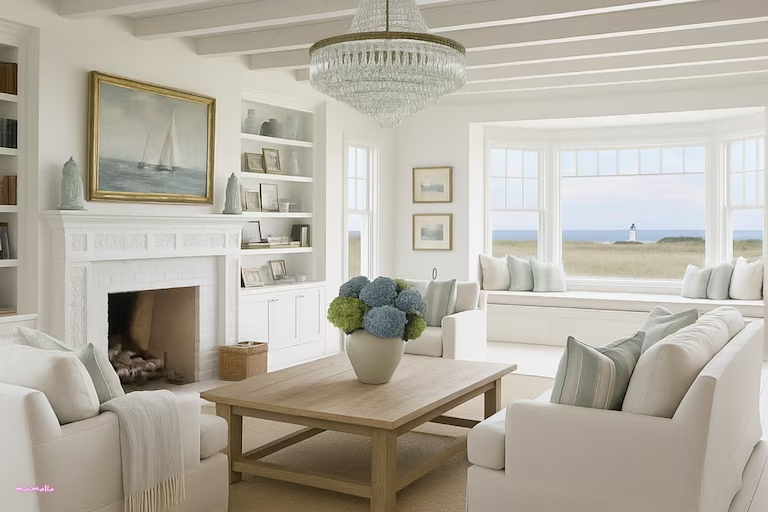
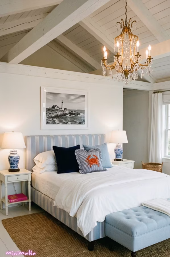
A bedroom is a reflection of your personality, but first and foremost it’s a place to unwind. We naturally gravitate toward soothing tones in our everyday environment to protect our sensory comfort. That doesn’t mean abandoning “lemonade” colors altogether it means learning to dose them.
So how do you recapture that energy without falling back into excess ? You could go for white or cream on most of your walls to bring in light, pastel versions of blue, pink, green and orange as a transition on a single accent wall and/or your bedding and finally the original preppy touches as decorative accents : a lamp, cushions, a decorative object.
The final ratio: 50% white, 30% pastel, 20% “lemonade” colors.
How to recreate it ? (ad)
FUTEI Hot Pink Chenille Throw Pillow Covers
2. Add few Preppy objects for a Preppy Room
The particularity of the preppy bedroom is that it’s an Aladdin’s cave of antique objects. You’ll find pieces hunted down at Saturday flea markets or inherited from grandma. This old money side is what elevates a mainstream space into a carefully decorated one.
Among the signature antique pieces of the preppy style, Chinese porcelain comes first in the form of vases, lamps and ginger jars. It comes in every color of the preppy palette, from monochrome pastels to lemonade tones. You can display them on the edge of a dresser or show them off in a cabinet alongside other decorative objects.
There’s another antique object that has become a classic in interior design: the antique clock. And not just any clock, the officer’s pendulum clock. It first appeared in 18th century France and was carried by military officers on campaign. Rectangular in shape and often in brass, this clock will bring a touch of elegance to your bedroom. I prefer the smaller models for a bedroom so it doesn’t feel too imposing on the nightstand. There are plenty of options on Etsy, but you can also hunt down beautiful pieces at flea markets.
One last tip for a neo preppy style, don’t overload the room with antique pieces. Choose two or three with care.
How to recreate it ? (ad)
JONATHAN Y 22″ Blue/White Ceramic Table Lamp
3. Bring back the Preppy bestiary

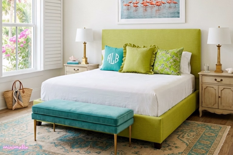
The preppy style was obsessed with animals in the early 2010s: the lobster, the flamingo, the crab, the whale.
Some of these animals were symbols of summers spent on the East Coast, like the lobster and the crab. Others became the muse of preppy brands the whale being the iconic logo of Vineyard Vines. As for the flamingo, it gained popularity as the emblem of Florida, a destination very much beloved by the American upper class.
In the preppy bedroom, these animals appear in different forms. First as mini hand-painted or gilded statues a miniature whale can work as a bookend on a shelf or as a decorative piece in the display cabinet.
These animals also show up in painted artwork. Flamingo paintings in particular are perfect for a preppy bedroom, there’s an understated elegance to them. A single painting can also easily echo the entire preppy color palette at once. Picture a flock of flamingos in a garden, green lawn, under the clear blue sky of a Florida summer.
Finally, preppy animals are most commonly found on cushions, adding a touch of personality to white cotton bedding.
As a rule, pick one totem animal and one or two pieces maximum for your bedroom otherwise it tips back into too much.
How to recreate it ? (ad)
2pcs Gold Crab Figurine Home Decor
4. Rethink the preppy monogram
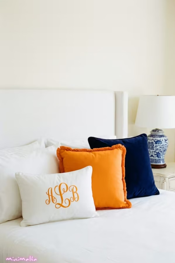
The monogram is one of the defining symbols of the preppy era. Brands started offering to embroider your initials on everyday objects: pillowcases, bedspreads, bath towels or even toiletry bags. You could even choose the thread color and the font. In bedroom décor, embroidery was most commonly found on cushions placed on the bed.
This democratized the personalization of home objects, a practice that had once been reserved for the elite.
Etsy also contributed to this movement by making embroidery accessible, and it still does today. It offers more subtle monogram styles than the preppy monograms of that era and ones that are far more current.
For a preppy bedroom that stands the test of time, I’d suggest a small monogram centered on the cushion rather than a large one that takes over the whole surface. And a cursive monogram embroidered on a white background, so much more elegant.
5. Opt for one preppy pattern
When the preppy style made its way into interior design, the first thing we saw was the use of preppy fashion prints on textiles.
The most common patterns of that era were:
- The signature Lilly Pulitzer hand-painted print
- Stripes
- Liberty/floral prints
- Nautical prints featuring anchors, crabs, shells and coral
These patterns were built around the preppy color palette: pinks, blues, greens and oranges. They were used endlessly, sometimes to excess. There were two categories of preppy prints.
The bolder ones, like the Lilly Pulitzer print and nautical motifs, appeared most often on bedroom textiles.
The more neutral ones, like stripes and liberty prints, were even used as wallpaper.
Today, if we wanted to bring these patterns back in a way that lasts, the key would be thinking carefully about how to integrate them into a harmonious bedroom.
How to recreate it ? (ad)
CPC Block Print Ruffle Throw Cover Agate Green
6. Think of Your Preppy Décor as a Whole
If you’ve made it this far, you’ve probably understood that the original preppy style was a style with a lot of character. That’s its strength but also its main flaw.
It brings together bold pieces that, mixed together, can create a kind of visual cacophony. You can easily imagine what happens when you combine blue, pink, green and orange, stripes and flamingos all in the same room 🫱 it becomes too much !
Think of your bedroom as a blank canvas. Stick to the three color maximum rule (white and cream included). Choose one animal to bring life to your canvas and add light with a beautiful Chinese porcelain lamp.
To make sure your new décor doesn’t feel overwhelming, I’d recommend keeping the flashy colors for your accessories, those 20% we talked about in part one.
And don’t hesitate to visualize your new bedroom by creating a Pinterest mood board to bring together colors, materials and prints before committing to anything.
The key word to remember for a preppy bedroom that becomes truly timeless? Subtlety.